How do place names differ across America?
by Lia Prins I used to travel to the East coast occasionally for work, and was always struck by how different the names of the towns there were compared to where I grew up in Washington state. Whereas the nomenclature of the Northwest seemed to be based on Native American languages (if not their Anglicized, Latin-character-converted equivalents), most monikers in the East sounded purely English to my ear. Now, after living in the San Francisco Bay Area — the naming practices of which seem to have been heavily (though unwittingly) influenced by several Spanish saints — I often wonder about the various pockets of American place-name patterns: How heterogeneous are the names of our nation’s locations, and on what dimensions? What stories are behind these toponyms, and how do they speak to the places they represent?


Rather than rely on my own limited anecdotes to answer these questions, I went in search of data. Although state names would constitute too small a dataset to isolate interesting trends, the fact that there are approximately 3,000 counties in the US made them (and their parish , borough , census area , independent city , and district counterparts) a much more promising starting point for my investigation into American toponyms . I found a list of most counties on Wikipedia, 1 along with a brief etymology for each. From there I manually classified each county by both the category and subcategory its name fell into (within a set of my own devising), and its language, if available. If language wasn’t mentioned and I couldn’t determine it myself from context, I conducted further research (Googling) to at least label it as Indigenous or non-Indigenous.
[County Name], [State]
[Etymology]
Category: [Category]
Language: [Language]
Geomapping both attributes of my newly minted dataset — category and language — exposed the fact that the vast majority of counties are named for people, specifically men, and of European heritage (or at least with European surnames).
Although women-honoring toponyms account for only 1.1% of all counties, they are represented slightly higher in states that themselves possess feminine names: Maryland, Virginia, and Louisiana (although the latter was actually named for French King Louis XIV).
Of those counties commemorating groups of people, nearly all bear Indigenous names. However, digging into their etymologies reveals that they’re not necessarily named in the language of the group they’re named for: to list a couple, the names of Wisconsin’s Outagamie and Ozaukee counties derive from Ojibwe words for their neighboring Meskwaki people (“dwellers on the other side of the stream”) and Sauk people, respectively. Even the few counties in this category given European names are likely to characterize Native American peoples — but based on what white settlers called them, not what they called themselves. For example, the names of Pend Oreille County, Washington; Nez Perce County, Idaho; and the two Huron Counties, in Michigan and Ohio; all originated from French terms used to describe the locals. Pend d’oreille means “hang from ear”, in reference to the Q’lispé people’s shell earrings, while nez percé alluded to the Niimíipuu people’s pierced noses. Huron was an attribution to the way the Wyandot people dressed their hair.
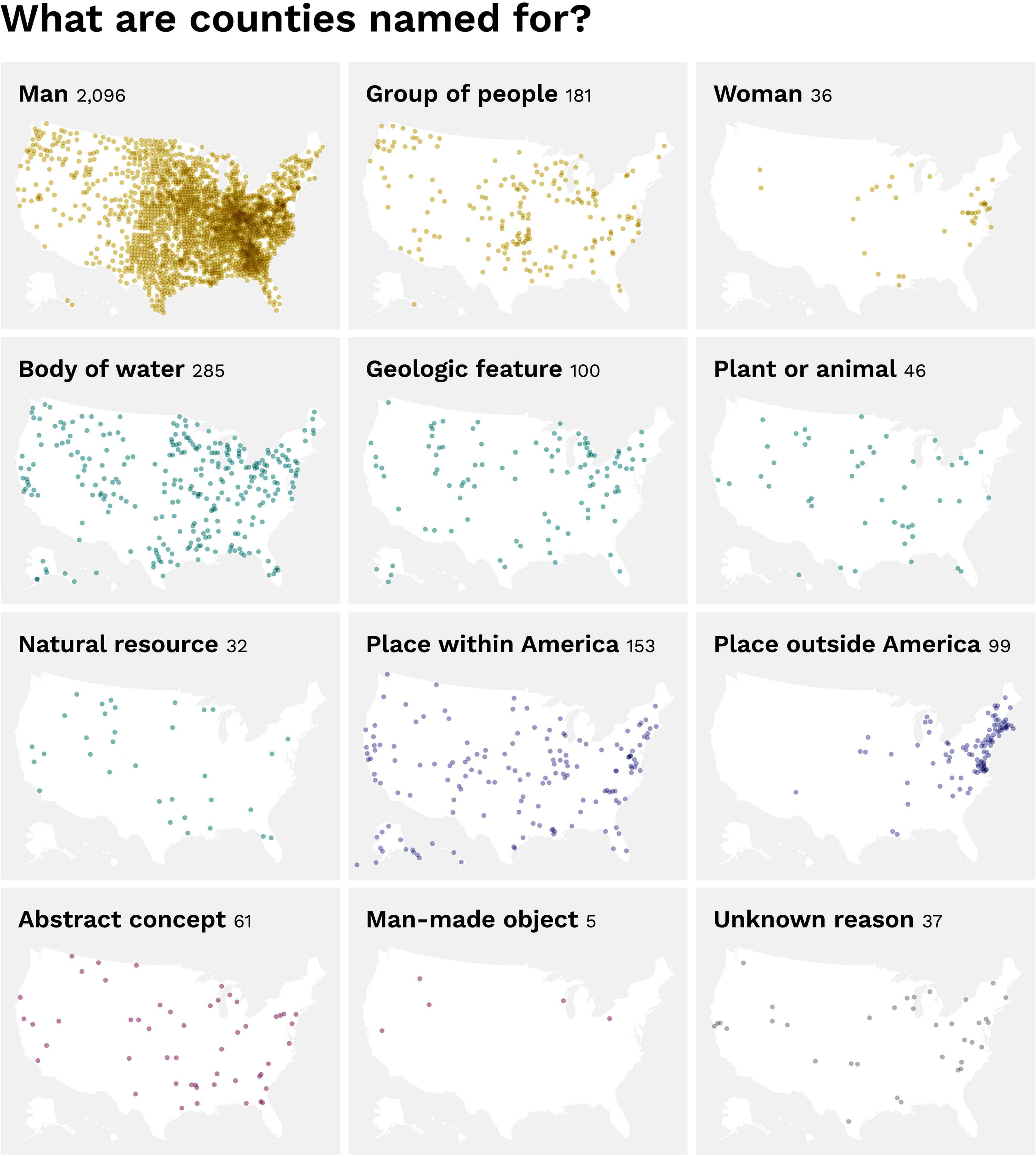

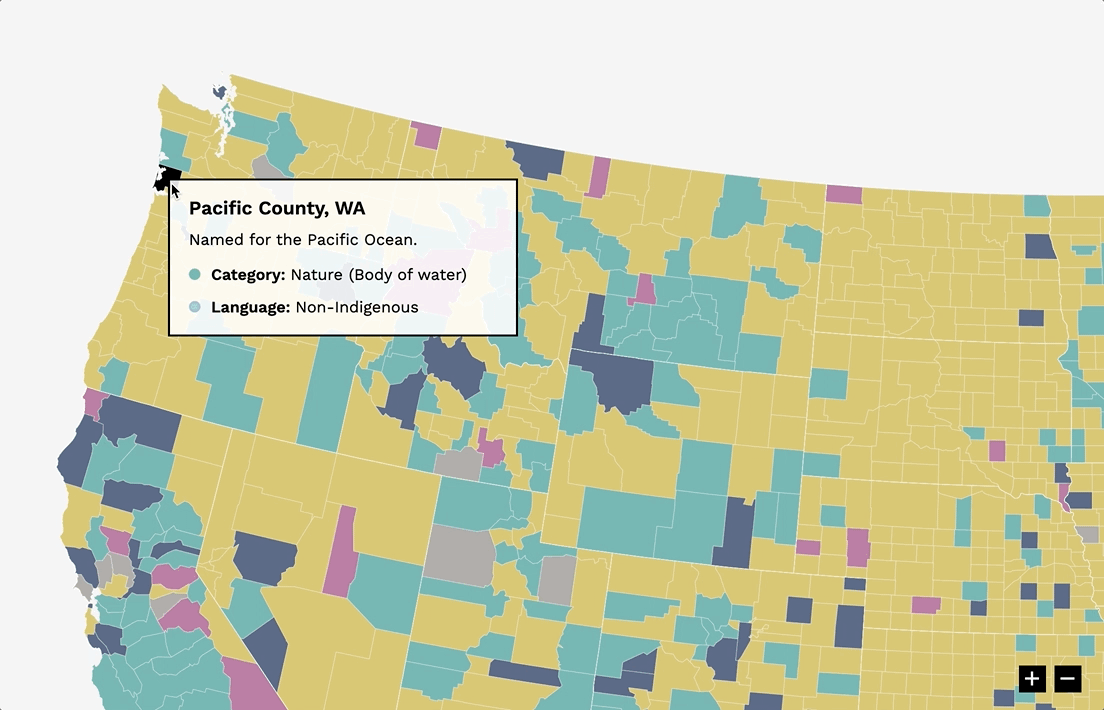
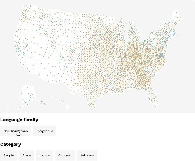
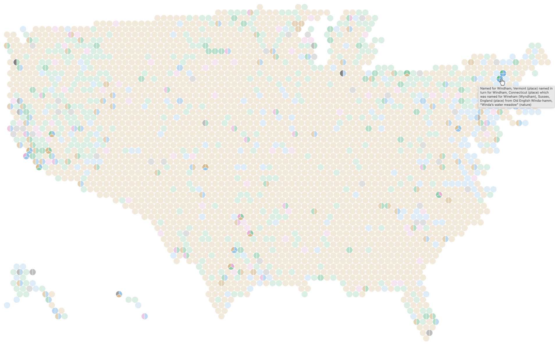
These maps show a more detailed breakdown of what counties are named for; each dot represents one county.
Clusters of counties named for English towns and regions blanket the Northeastern seaboard (as was my business-travel-induced hunch), particularly around Jamestown, Virginia and Plymouth, Massachusetts — the two earliest British settlements on the continent. Likewise, Spanish names are common in the Southwest and areas that were founded after the Mexican-American War. French names are sprinkled throughout several states, but primarily within those whose land was acquired via the Louisiana purchase. In fact, French-named counties are more highly concentrated in Louisiana itself, as well as the Great Lakes region. The former served as the French headquarters for New France before it came under American control as part of the titular Louisiana Purchase; the latter was popular with fur trappers seeking to supply France’s fashion demands.
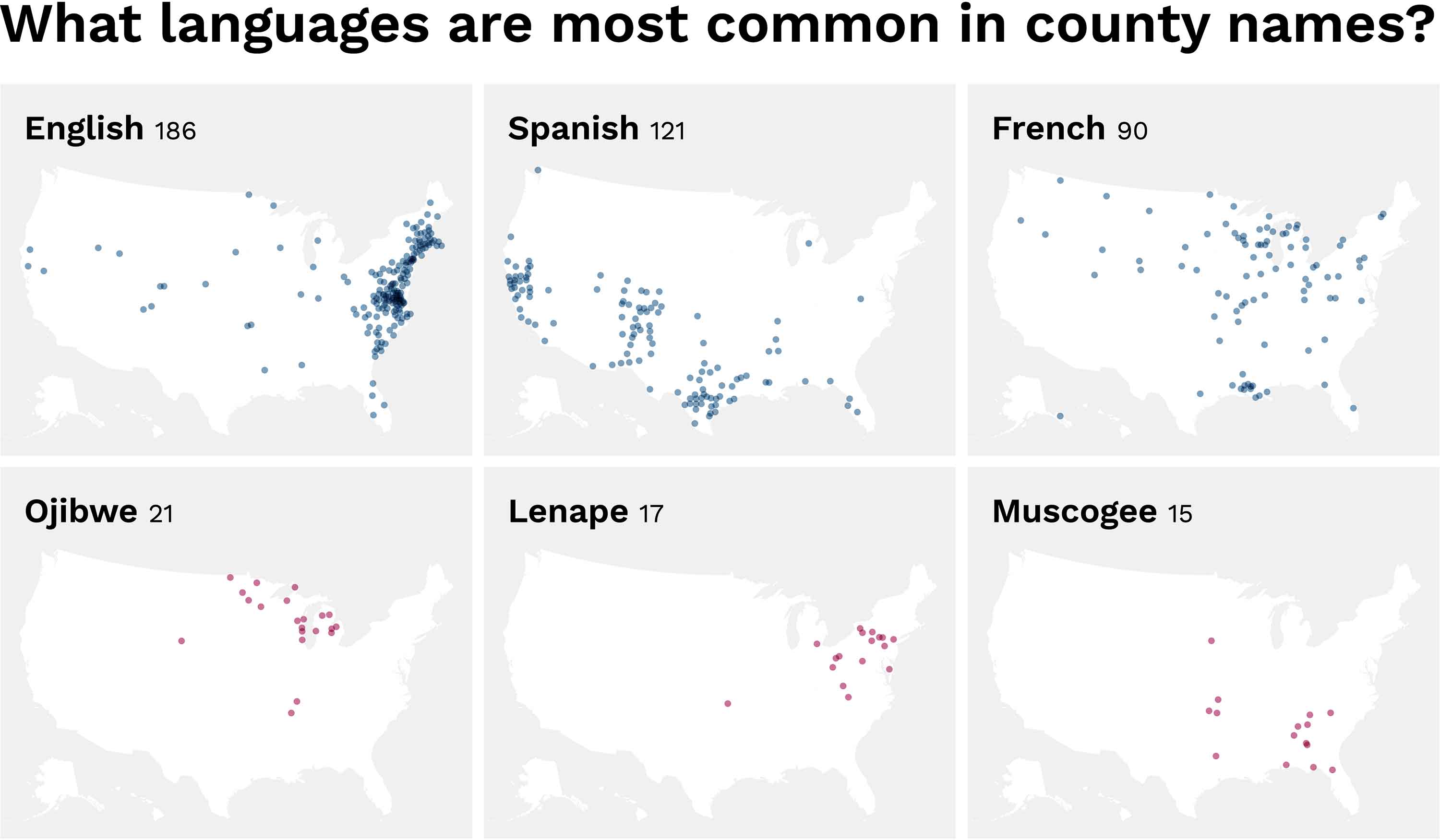
These maps show the six most common languages appearing in county names. Each dot represents one county; each map is colored according to whether or not that language is Indigenous.
So, what’s in a (county) name? Quite a bit, it would seem. And yet at the same time, not nearly enough.
The name assigned to the Q’lispé people and the land they occupied, and ultimately the county that land would become — Pend Oreille — originated from outsiders observing a single salient attribute of their appearance. It sounds rather reductive when compared to their own name for themselves: Q’lispé literally means “the people”. Jefferson Davis could not have hoped to (and — to put it excessively mildly for brevity — actively went out of his way not to) represent all citizens of the four counties bearing his name, let alone the more than 15,000 Black people at the times of the counties’ foundings, nor those at the time of this writing. The same can be said of over 60 other counties 2 currently commemorating Confederates.
Conversely, consider Kay County, Oklahoma (originally K County), its name the relic of an arbitrary, alphabetical indexing system, and by all rights, the poster child for blameless neutrality. Though quaint and quirky as a one-off tale of temporary toponymy gone awry, its original name was, by design, meaningless and forced. What if all counties shared its same story? We’d essentially have county barcodes in place of county names, and what a languishing landscape that would paint (literally, too — my maps would all be one color!).
Names will always be imperfect embodiments of the places and people they stand for. The good news is that (after painstakingly encoding several thousand lines of unstructured data), it’s possible to bring to light anecdotes of anthropological allure as well as patterns of inequity, which in turn often serve as evidence for change.

Process

Here’s where I explain a bit about the experiments and explorations that go on behind the scenes while I'm preparing a post.
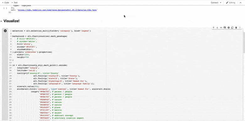
Making this post has required — and facilitated — a lot of learning! I coded well over 100 visualizations (actually 180 so far) with D3 using the dataset I made, the creation of which was itself also a major learning endeavor. Why’d I make so many vis’s? In part because so many new and nuanced questions emerged as I encoded and refined the dataset I needed to answer my initial question about how place names differ across the country. Also in part because I just couldn’t stop myself: visualizing data in the completely customizable way enabled by D3 is truly addicting. I routinely woke up at 3:00am unable to sleep, with a potential solution to my latest coding problem burning in my brain, so of course I had to test it right then.
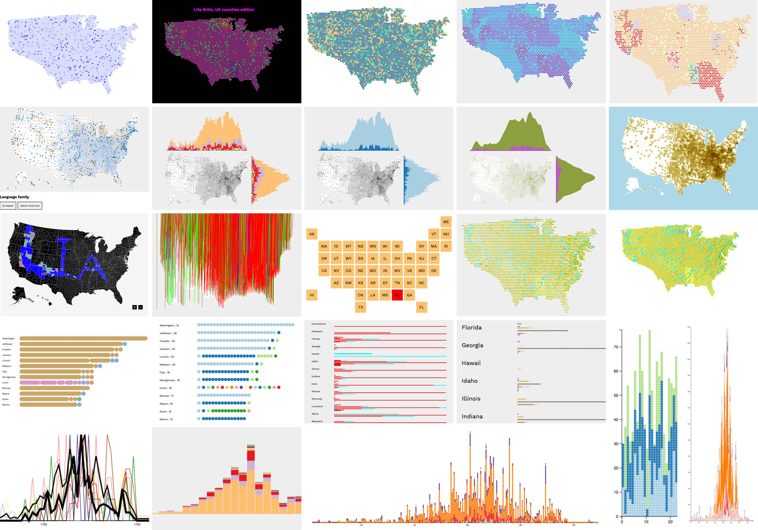
A small selection from the cutting room floor.
While this level of passion served as a phenomenal boost in helping me to learn the ins and outs of D3 quickly, I’m certainly not as good at it as I want to be. There’s still a looming gap between the ideal visions of visualizations I see in my head and what I’m capable of bringing to life on screen (at least within any semblance of timeliness). To quote Ira Glass on the subject: “… all of us who do creative work, we get into it because we have good taste. But it's like there is this gap. For the first couple years that you're making stuff, what you're making isn't so good. … But your taste, the thing that got you into the game … is good enough that you can tell that what you're making is kind of a disappointment to you …”
Nonetheless, I try very much to believe that something is better than nothing (touted by the “recovering” half of my “recovering perfectionist” self), as in: it’s better to have shared my interesting learnings on a topic (even if the method by which I do so could have been slightly more fabulous), than to have not done so and just kept all my hard work and interesting insights buried on my laptop. To that end, I’m sharing some of my less polished (or should I just say more rugged) chart-babies and the insights they uncovered as I iterated my way to the final vis’s I ended up using within the main post.
Correlations between county name types and languages
I initially built an interactive visualization with Altair (a Python visualization library) to get a sense of the relationship, if any, between what a county was named for and the language it was named in. As I noted in the main post above, the primary correlation seemed to be that not only were the vast majority of counties named for men, but for men with European surnames. (This I’d actually noticed far before visualizing the dataset, while reading each county’s etymology to classify its category. I coped with the severe lack of gender equality by attempting to be grateful that this made for a much more efficient data-encoding process (especially when I got to Georgia, Kentucky, Mississippi, and North Dakota): so much easier to repeatedly copy-paste “man”, “man”, “man” row after row than to manually type a distinct category each time!)
Altair (used to build this exploration) is my favorite Python visualization library that I’ve encountered thus far. But you’re still limited to pre-established chart types, which ultimately led me to my current D3 obsession!
When I started working more in D3, I further customized the filtering capabilities, and spent a lot of time (mostly the wee hours of the night) experimenting with various cross-filtering approaches. This was a really fun and all-consuming point in my D3 learning journey.
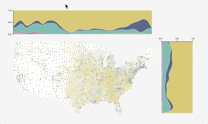
Each county is demarcated by a symbol, the orientation of which indicates its high-level language grouping, and the hue of which represents its name’s category. Filtering by either dimension highlights counties that meet both criteria.
Regional patterns distilled latitudinally and longitudinally
In my initial designs with the cross-filters (above), the vast amount of space surrounding Western counties’ symbols compared to Eastern counties’ made it difficult to discern regional differences, which was at the heart of my initial question. To this end, I made a visualization that isolated latitude and longitude as their own independent dimensions, and which showed a breakdown of name types — and languages, separately — as ratios (binned and calculated as a somewhat hacky kernel density estimate plot). The obvious difference in county-density from East to West intrigued me in itself and I wanted to see it quantified, so I also built a version that just tallied up raw counts along each dimension. Ideally, viewers could toggle between category and language, and then also between an aggregate of raw counts and a percentage of total. I did manage to build each of these permutations (🥳), but right now they’re just four separate charts, rather than a single changeable view.
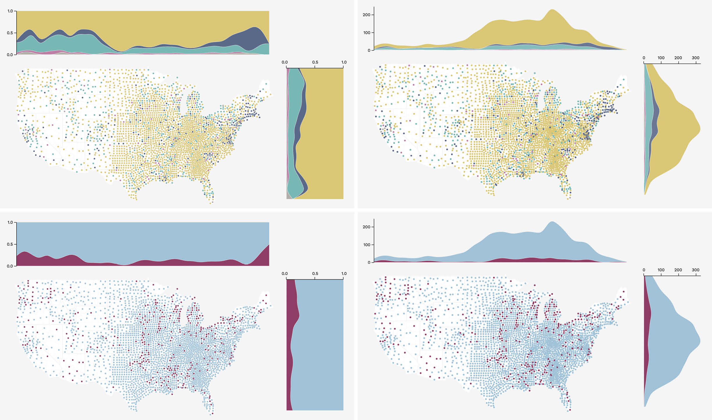
County names broken down longitudinally and latitudinally by category and language, shown as raw counts and ratios.
I also wanted to make it so viewers could hover on any “chunk” within the stacked area breakdowns to highlight the corresponding counties within the map, and vice versa. And ideally you could select various slices along the North-South and West-East dimensions to highlight the corresponding counties falling within that range.
Hovering a “chunk” reveals the counties that contribute to it.
Oh yeah, one more thing on my wish list for this vis: I wanted to be able to select a distribution chunk from a stacked area breakdown to filter out all counties except those matching the specific high-level category or language selected, and then rescale the distribution to split out its sub-categories or more granular languages. I actually built a very similar interaction while learning the fundamentals of D3 initially, as part of the final coding exercise in Scott Murray’s excellent book Interactive Data Visualization for the Web (highly, highly recommend!).
Just imagine: this functionality, but applied to the static charts shown above! (Maybe someday I’ll make it really exist so you don’t have to imagine. Someday … after I’ve recovered from both the PTSD caused by figuring out how to make this one and the extreme shock I experienced when it finally actually worked correctly.)
Exploring the visualizations I made revealed some interesting observations! Male-inspired monikers seem to subside in Western states; conversely, the relative rate of nature-induced names climbs steeply (West coast is the best coast afterall 😛). And as I had hypothesized, the Northwest could be argued to exhibit the highest percent of counties with names in Native American languages (if you don’t count the somewhat skewed reading caused by the fact that the Eastern-most bin contains only a few counties). However, this rate is really not so high, and not nearly as pronounced as I’d predicted, relative to the rest of the country.
I learned so much while working on this vis, not only in terms of technical skills, but also more nuanced answers to my questions about American toponyms.
Relationships between counties’ names and their ages
An obvious follow-up to the question of how place names differ across two-dimensional space is how they differ across time. These two traits, however — location and time — are inextricably tied given the history of westward expansion, or so I hypothesized. I tried various ways of mapping counties’ ages to their places on a map, which yielded whimsical, if somewhat incomprensible, results. But they didn’t really help me answer how names differ based on when they were given.
Each vertical line is a county; the shorter it is the younger it is. (Also, if the contiguous United States was a dry-clean-only sweater that you definitely were not supposed to wash yourself, let alone put in the drier, but you did, and then tried to stretch it to fit again, is this what it would look like?)
I also tried simultaneously mapping hue to name type (and language, as its own vis), and lightness to age. This unfortunately prevented the darkest values (tied to the youngest counties) from being able to be all that dark, since they still had to be recognizable as distinct colors, and all had to maintain the same starting value to keep from visually biasing the age-attribute of the data. However, this color palette proved to be too monochrome, un-contrast-y, and unsightly to proceed with! I won’t drag you through all the hours of fastidious color-for-dataviz secondhand research I conducted … I will just gratefully point you to Lisa-Charlotte Muth’s invaluable compendium on the topic!
Color value mapped to county age: the older, the lighter.
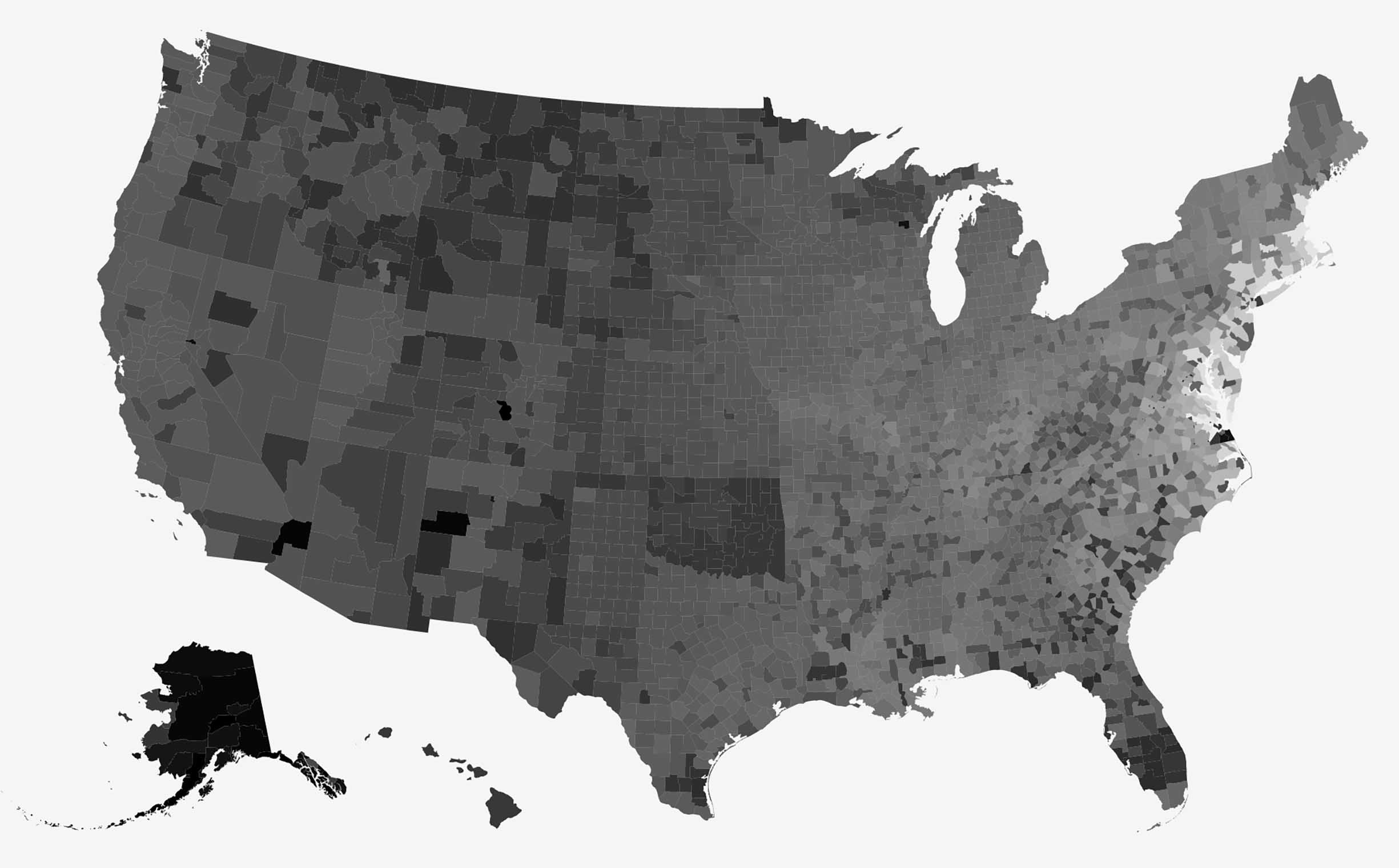
Given the limitations of a hue-encoded map, I just had to try out an all-greyscale version, wherein the counties’ age range could span the full gamut from nearly white (oldest) to black (youngest). It doesn’t really help to answer my initial question of how county names differ from place to place, but it is fascinating, if I do say so myself. (And this type of rabbit-holing is the epitome of why it took me so long to publish this post!)
What I really wanted to do was build a jointly interactive timeline-and-map combo. Brushing over binned decades in a stacked histogram showing name-type or language breakdowns would highlight where the counties that had been named within those selected decades lived on a map (and maybe even vice versa).
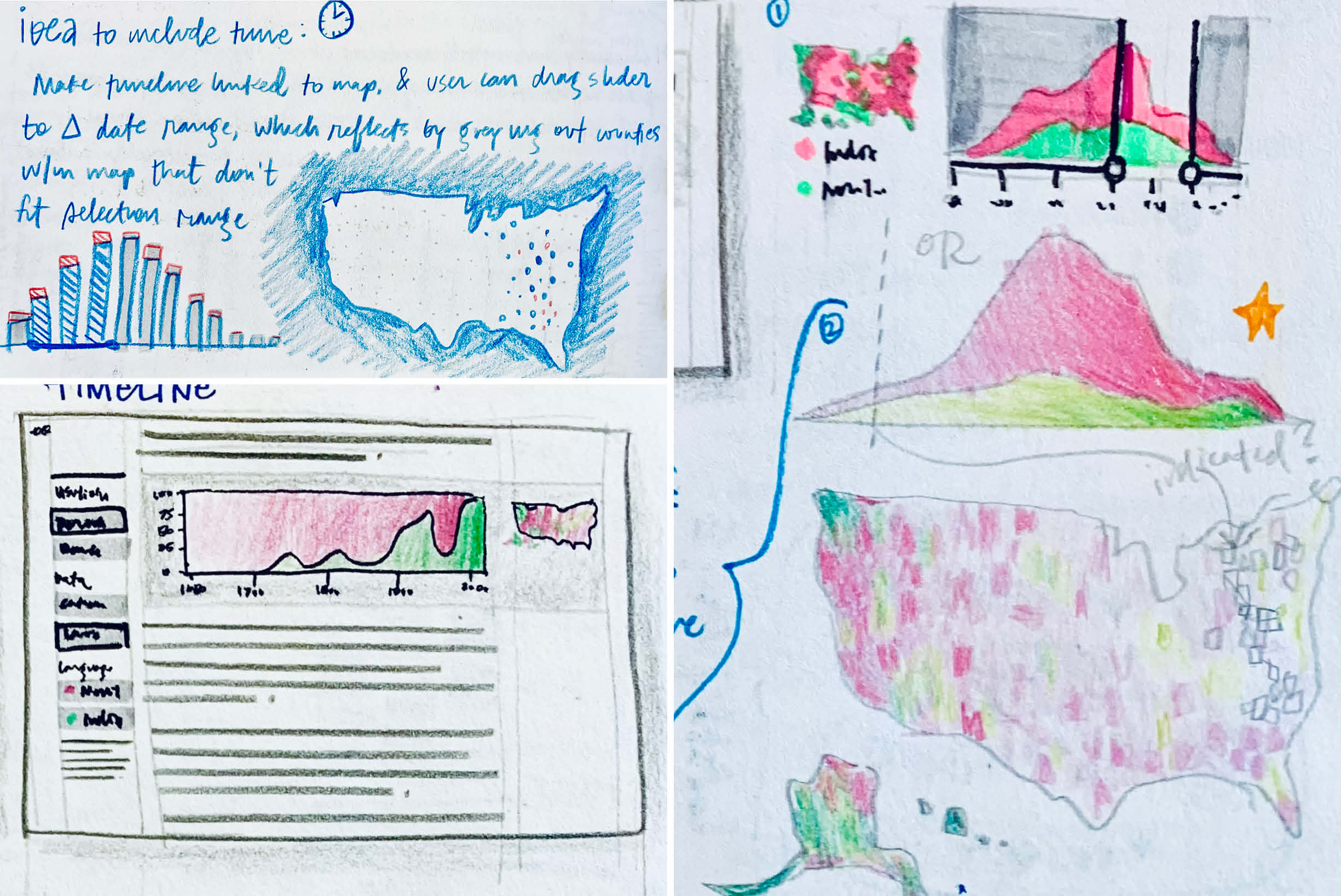
Ideas for an interactive timeline and map.
Eventually I did try just the binning by decade concept, separately for name type and language, and also separately for raw counts and rates. Ideally you’d be able to toggle between each of these within a single view (like my vision for the latitude-longitude KDE-geomap hybrid).
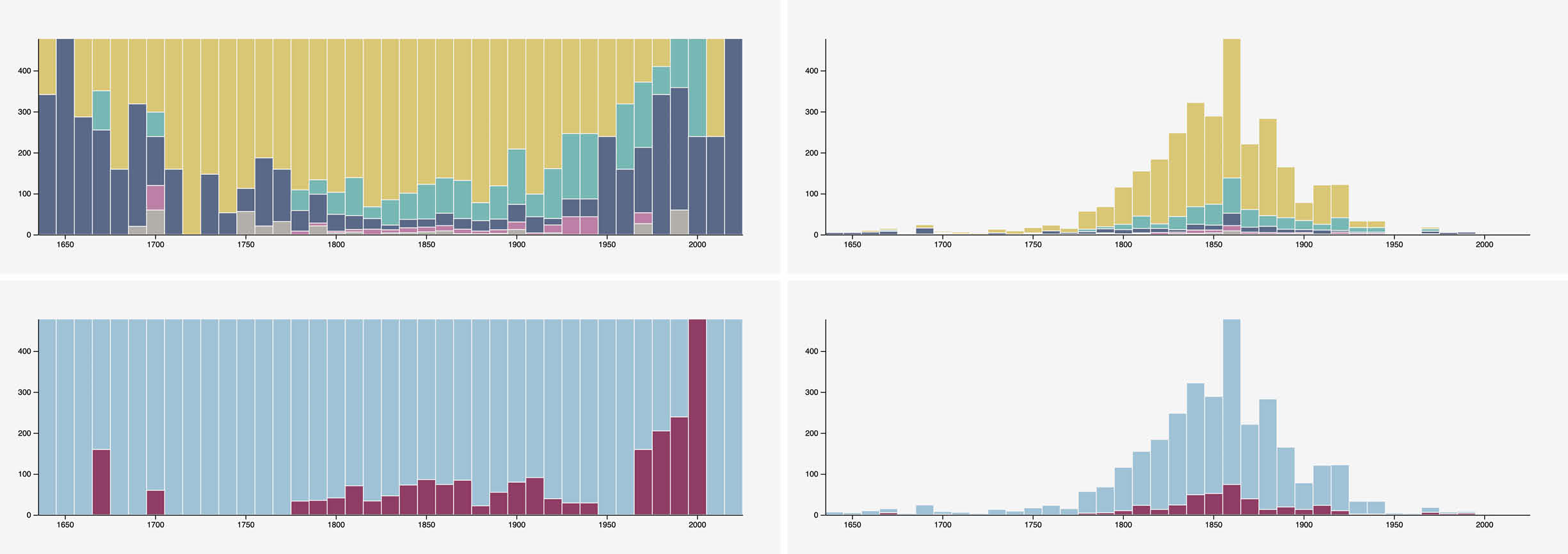
Stacked histograms broken down by county name type and language, shown by raw count per decade and by ratio.
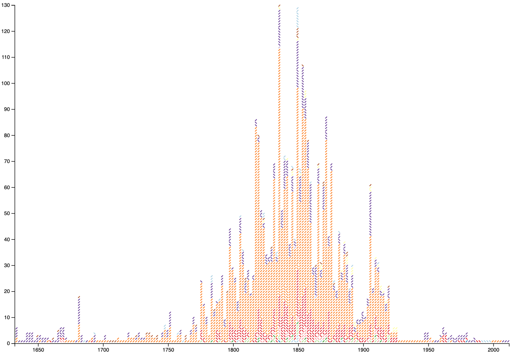
A more “experimental” — shall we say — version of the stacked histogram, using symbol orientation to represent high-level language groupings in the same way that my initial cross-filter visualization did, while also tying color to each county name’s category. While it was too difficult to parse, it did create some distractingly mesmerizing Greek-key-like patterns!
States’ effects on their counties’ names
The most accurate way to determine whether states themselves have had any influence over their counties’ names would be to get more data science-y about it: First, develop a way to predict what a county name’s type and language would be at any given spot in the US, based on the other counties’ name types and languages, and their locations relative to that spot. Then, do that for all counties per state, and compare those predictions to the states’ actual breakdowns. But I don’t quite know how to do that (yet), and I had a different idea in mind: to show each state’s name type and language breakdowns as stacked proportional bar charts laid out as tile maps.
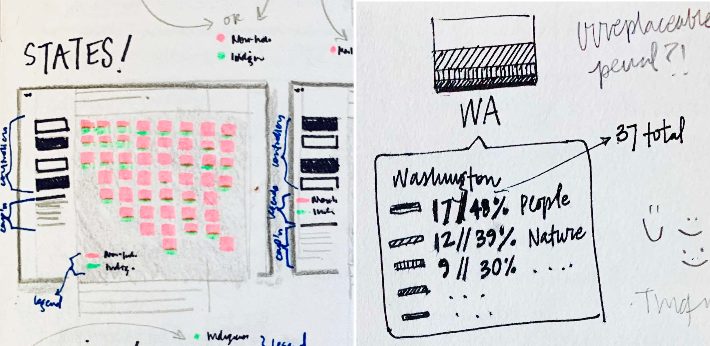
An 8-bit interpretation of our nation.
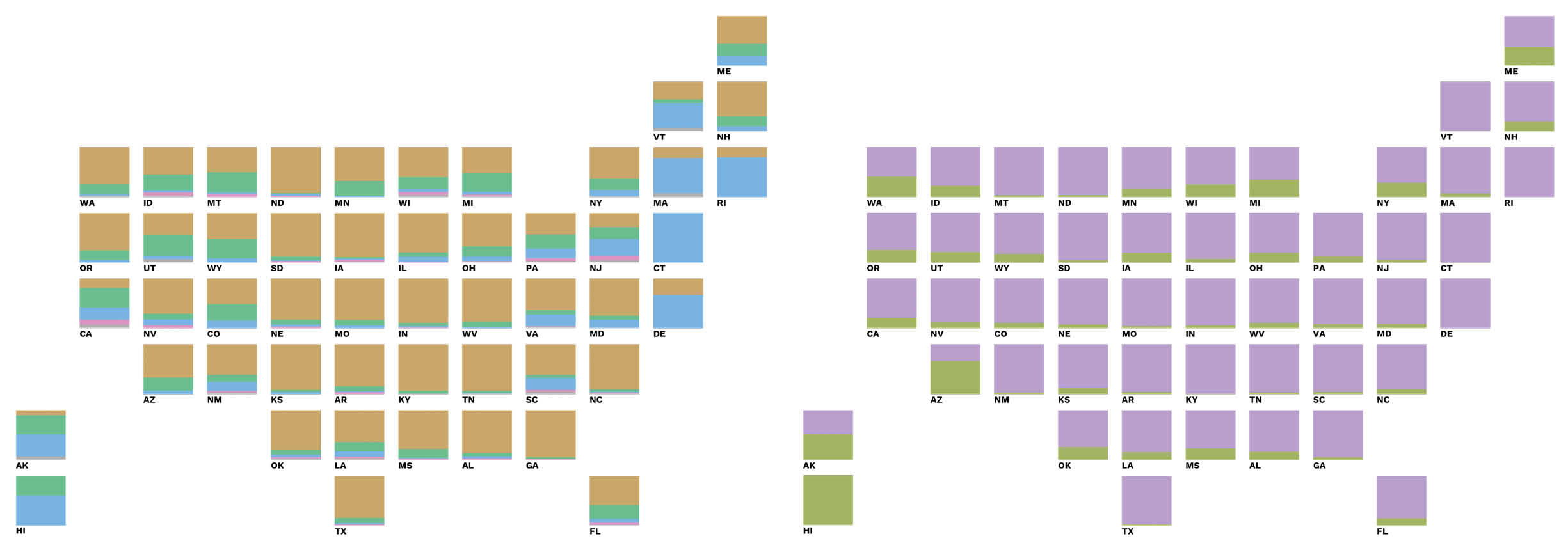
I found it difficult to detect any state-induced patterns with these tile maps that weren’t already apparent as more general regional trends.
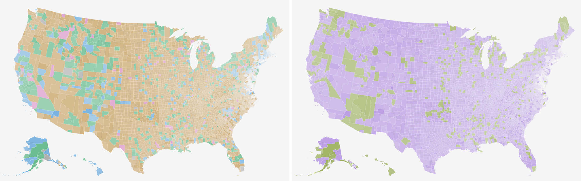
This didn’t reveal much, though, except for maybe one interesting anomaly: although Arizona and New Mexico share a border of significant length, there seem to be stark differences between their county naming schemes. 80% of Arizona’s counties possess a Native American name, while only one of New Mexico’s does, accounting for just 3% of the state’s total. At first I thought this discrepancy could be explained away by timing: maybe New Mexico entered the Union via one of the Western land acquisitions substantially sooner than Arizona did, and perhaps toponym trends changed with time. But it turns out they were both granted statehood in the exact same year — 1912 — and just over a month apart. Statistically it would seem that in this case, each state itself had a heavy hand in informing its counties’ names.
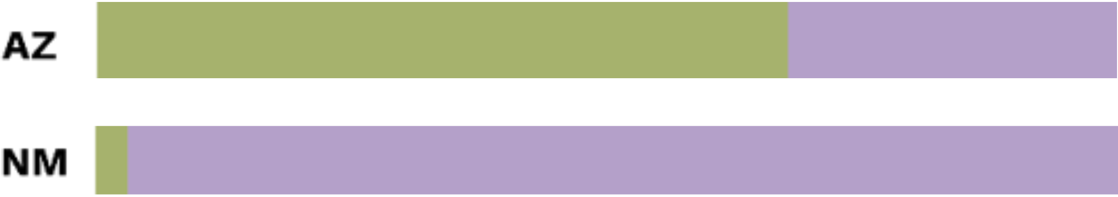
Despite their shared border, Arizona’s and New Mexico’s county naming practices seem to be quite different. Green accounts for counties named in an Indigenous language; purple for those in a non-Indigenous language.
Counties named for multiple things or people, indirectly
As I continued to refine the classification system I used in my dataset, I often found myself stumped by a recurring predicament: although many counties were named for one thing on the surface, ultimately that thing was sometimes named for another thing — often several times over — collectively forming a trail of interlinked etymologies. For example, Jefferson County in Colorado is named most directly for an extralegal territory which itself bore the name Jefferson Territory, but which had in turn ultimately been named for Thomas Jefferson. (Relatedly, in my research I learned that Jefferson Davis’s father named him after Thomas Jefferson… So are the four Jeff Davis counties actually commemorating Thomas Jefferson?)
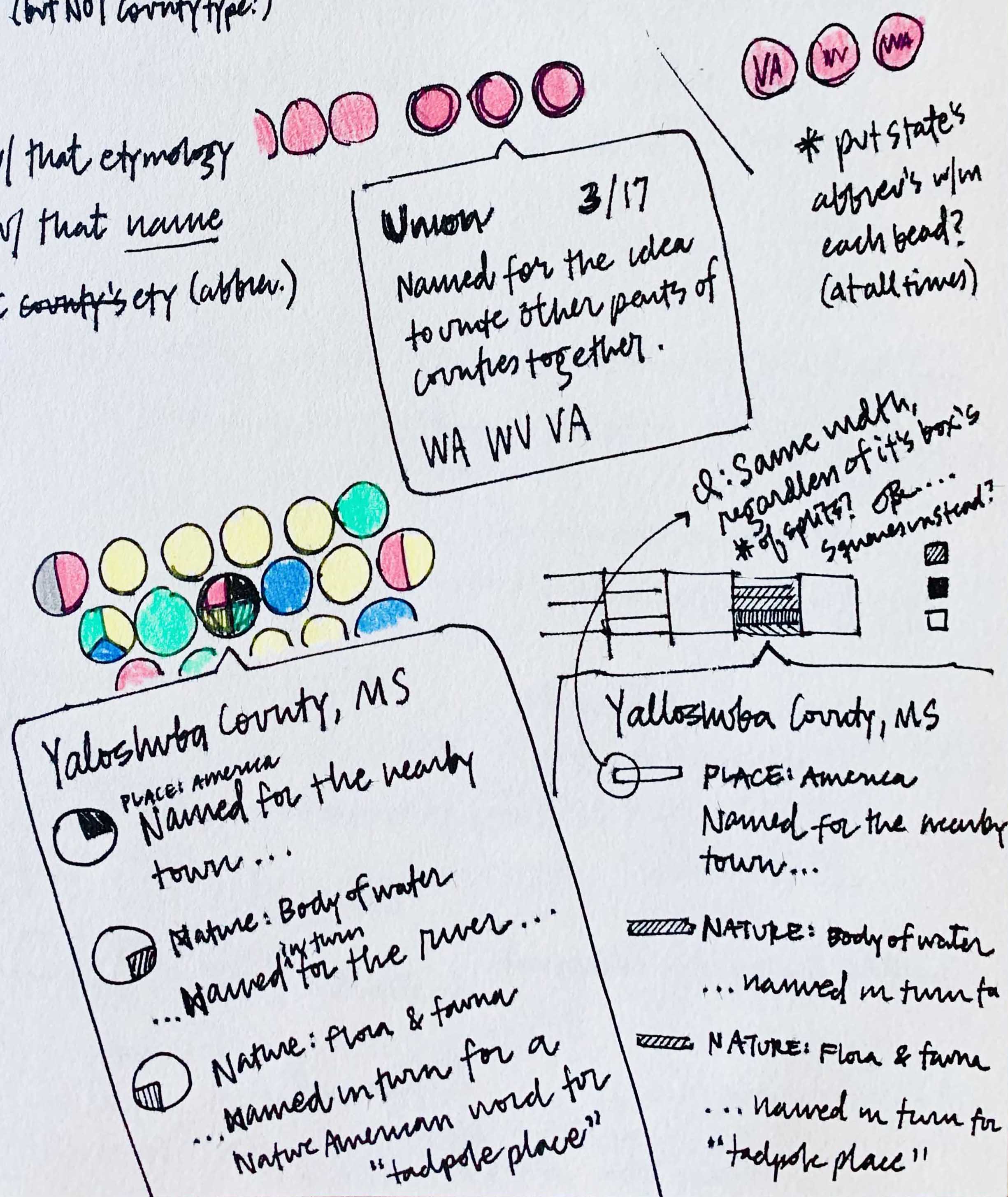
This made me want to see an “etymological chain” per county, which of course required much more manual tweaking to my dataset. I tried a cartogram-like layout with all counties packed together, each its own teeny tiny pie chart of sorts divided into the number of “links” within its etymological chain and colored according to name type. Then I desaturated counties with fewer links to help those with longer name-histories pop out.
At least 5% of counties have an indirect name source (likely this number is much higher; this is just based on what I could glean directly from the etymologies provided on Wikipedia). California in particular bears a relatively high rate of counties exhibiting this pattern: several were initially christened for missions or natural features, the names of which in turn paid homage to Spanish saints. The Northeast’s propensity for pre-existing place names ultimately just meant more man-memorializing monikers if you go deep enough, because their surface-level European namesakes were themselves often named for men.
Each county transmogrified into an itsy-bitsy pie. (Try not to harm your computer due to imminent cute-aggression!)
Exploring ways to reveal the stories within etymological chains via tooltips.
Common county names versus common etymologies
During my dataset creation process, I noticed certain county names popping up repeatedly from state to state. In fact, only 46% of counties possess a unique name, and over 8% bear a name belonging to at least 14 other counties.
In the case of the most common county name — “Washington” — all are named directly for George Washington. Of all the 24 “Lincoln” counties however, only 17 honor Honest Abe; most others commemorate a general from the Revolutionary War, and a couple are ultimately named for a city in England.
Ironically, “Union” counties have the most disparate set of etymologies, including — even more ironically — an homage to a Georgian political party whose main agenda was to eradicate Native Americans from the area. Hardly a uniting sentiment!
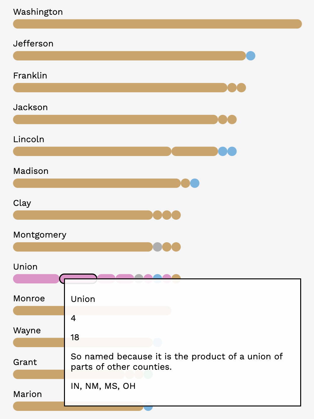
I visualized this data as a series of stacked bars; each stack is color-coded by name type and aggregated by etymology. I also experimented in Tableau with this concept a bit, and you can actually interact with it and explore some of the patterns yourself!
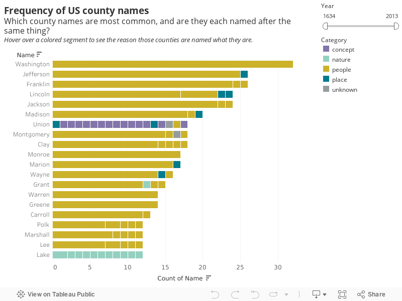
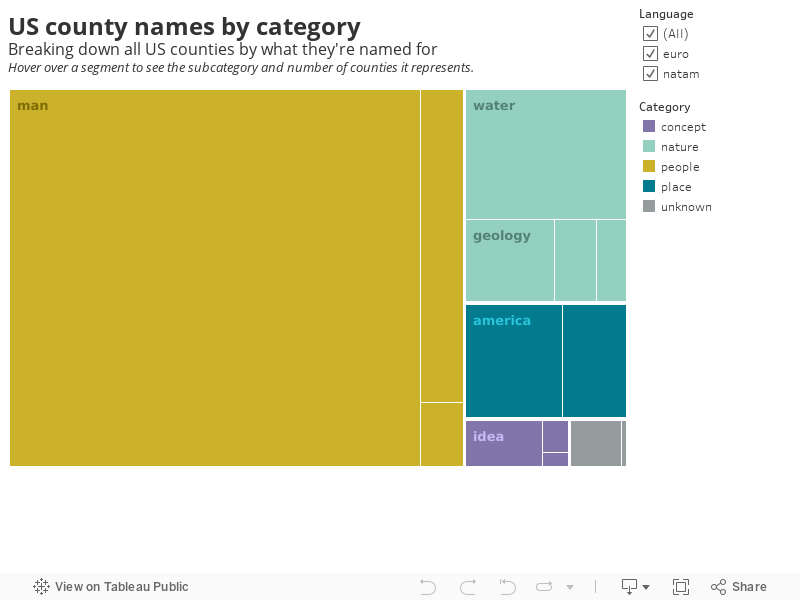
Overall name type and language breakdowns
While exploring with Tableau, I tried mapping out the ratios of each name category and each language across all counties. The visualizations really speak for themselves!
I’ll be sharing more of my chart-children from the process of developing this post on Instagram, so follow along there to see even more somethings that are better than nothings!
P.S. Are you as Hamilton-obsessed as I am (yes, still)? If so, poke around the map at the top of this page to see (or rather, hear 🎶) where some of the personalities made names for themselves, hint hint.
Glossary
-
borough
/ burr-oh /

-
Delegates to the Alaska Constitutional Convention wanted to avoid the traditional county system and adopted their own unique model with different classes of boroughs varying in powers and duties. Definition from Wikipedia.
- census area
-
The remainder of Alaska’s land not belonging to boroughs is divided into 11 census areas, each roughly corresponding to an election district. These areas exist solely for the purposes of statistical analysis and presentation; they have no government of their own. Definition from Wikipedia.
- county
-
An administrative or political subdivision of a state that consists of a geographic region with specific boundaries and usually some level of governmental authority. The term “county” is used in 48 US states, while Louisiana and Alaska have functionally equivalent subdivisions called parishes and boroughs, respectively. Definition from Wikipedia.
- district
-
The District of Columbia (Washington, D.C.) is outside the jurisdiction of any state, so has a special status, but is considered a county equivalent by the United States Census Bureau.
- independent city
-
A city that is not in the territory of any county or counties and is considered a primary administrative division of its state. Definition from census.gov.
-
Meskwaki
/ muh-skwah-kee /
-
The Meskwaki Nation people are of Algonquian origin from the Eastern Woodland Culture areas and have been historically located in the St. Lawrence River Valley, Michigan, Wisconsin, Illinois, Missouri, and Iowa. After fighting in the Fox Wars and being relocated multiple times, the Meskwaki formally purchased land in Tama County, Iowa, which gave formal federal identity to the Meskwaki people as the “Sac & Fox of the Mississippi in Iowa.” Definition from the Meskwaki Nation website.
-
Ojibwe
/ oh-jeeb-way /
-
The Ojibwe (also Ojibwa, Ojibway and Chippewa) are an Indigenous people in the United States and Canada who are part of a larger cultural group known as the Anishinaabeg. Anishinaabemowin (also called Ojibwemowin, the Ojibwe / Ojibwa language, or Chippewa) is an Indigenous language originally spoken by the Ojibwe people. According to the 2016 Census, 28,130 people are listed as speaking Anishinaabemowin. Definition from The Canadian Encyclopedia.
-
Outagamie
/ out-uh-gamm-ee /
-
A French transliteration of “Utagami”, the Ojibwe term for the Meskwaki people, meaning “dwellers on the other side of the stream”, referring to their historic habitation along the St. Lawrence River. Definition from Wikipedia.
-
Ozaukee
/ oh-zock-ee /
-
From “Ozaagii”, the Ojibwe name for the Sauk people. Definition from Wikipedia.
- parish
-
Historically, a small administrative district typically having its own church and priest, which grew out of Louisiana’s heavily Roman Catholic-influenced past. The name “parish” has remained, although they function similarly to counties. Definition from World Atlas.
-
Sauk
/ sock /
-
“Sauk” refers to the group’s exonym (what others call them), “Ozaagii”, used by neighboring Ojibwe people to mean “those at the outlet” of the Saginaw River. This name was transliterated by the French, and eventually, the English, as “Sauk”. The group’s autonym (what they call themselves), “Oθaakiiwaki” means “people of the yellow earth.” Definition from Ohio History Central.
- toponym / top-uh-nimm /
-
A place name. Definition from Oxford Languages.